Branding Guidelines
Brand and visual standards for Benecon, VERIS, and ConnectCare3.


These Brand Guidelines should be used to guide the development, design, and production of Benecon, VERIS, and ConnectCare3 brand materials. This will ensure consistency and cohesiveness between all corporate, sales, and marketing materials created for Benecon and its associated brands.
The Benecon Brand Heritage Story
This is our story of origin, our current state, and insight into our future.
In the early 1990s, born from a traditional insurance agency with an eye towards innovation, Benecon’s founders formed the first self-funded health insurance cooperatives for regional municipalities.
In the early 2000s, Benecon evolved the idea of growing self-funding purchasing groups for businesses into several private consortiums across the country.
Today, insurance brokers rely on Benecon’s self-funding platform to offer small and medium-sized businesses high value health plans, financial stability, and peace of mind.
Approved Company Description
Benecon provides self-funded medical benefit programs, offering a full suite of actuarial, compliance, finance and producer services to thousands of public and private sector employers and hundreds of thousands of employees across the United States. Benecon’s offering allows employers to effectively control benefit plan expenditures and design programs that meet both the strategic needs of the employer and the personal needs of the employees. Benecon’s subsidiary, ConnectCare3, provides wellness consulting and clinical services, including patient advocacy, nurse navigation and chronic disease management.
Logos
Benecon Logo
Below are the acceptable versions for all Benecon logos with guidelines for application of logos in design.
Full Color
Use the full color logo whenever possible.
Full Color with Tagline
The tagline is optional and should only be used when legible at output size.
White
Use the white logo over dark background.
White with Tagline
For use over dark backgrounds. The tagline is optional and should only be used when legible at output size.
Usage Guidelines
Protecting the integrity of our brand identity is essential—it is important that we avoid using our logo incorrectly. Follow these guidelines for using the Benecon logo in designs.
- ALWAYS ensure there is sufficient contrast with the background—whether the logo is placed over an image, solid color, or pattern—for maximum legibility of the logotype.
- NEVER alter the logo—do not change color, do not add effects (e.g. drop shadow etc.), do not distort proportions of the logotype, do not change spacing between elements.
- Never use the logo as part of a text block or rolling copy—when writing, spell out the full company name.
VERIS Logo
Below are the acceptable versions for all VERIS logos with guidelines for application of logos in designs.
Full Color
Use the full color logo whenever possible.
Grayscale
For grayscale or “black and white” applications only.
Black
For 1-color applications over light backgrounds.
Full Color, Reverse
Use over dark backgrounds, provided there is sufficient contrast.
White
For 1-color applications over dark backgrounds.
VERIS Logomarks
Below are the acceptable versions for all VERIS logomarks (icon only) with guidelines for application of logomarks in designs.
Logomark, Full Color
Use the full color logomark when thewhole logo isn’t needed (e.g. 2nd sheet letterhead).
Logomark, Black
For use over light backgrounds.
Logomark, White
For use over dark backgrounds.
Usage Guidelines
Protecting the integrity of our brand identity is essential—it is important that we avoid using our logo incorrectly. Follow these guidelines for using the VERIS logo in designs.
- ALWAYS ensure there is sufficient contrast with the background—whether the logo is placed over an image, solid color, or pattern—for maximum legibility of the logotype.
- NEVER alter the logo—do not change color, do not add effects (e.g. drop shadow etc.), do not distort proportions of the logotype, do not change spacing between elements.
- Never use the logo as part of a text block or rolling copy—when writing, spell out the full brand name in all Capital letters so it reads, “VERIS” (never “Veris” or “veris”).
ConnectCare3 Logos—Stacked
Below are the acceptable applications for the stacked version of the ConnectCare3 logo—stacked is the preferred version to use. On the next page is an alternative version for occasions when the stacked logo does not work in a design.
Full Color Stacked
Use the full color stacked logo whenever possible.
Full Color Stacked with Tagline
The tagline is optional and should only be used when legible at output size.
White Stacked
Use the white stacked logo over dark background.
White Stacked with Tagline
For use over dark backgrounds. The tagline is optional and should only be used when legible at output size.
ConnectCare3 Logos—Horizontal
Below are the acceptable applications for the horizontal version of the ConnectCare3 logo. Use the horizontal version of the logo as needed when the stacked logo does not work in a design.
Full Color Horizontal
Use the full color horizontal logo as needed when the stacked logo does not work in a design.
Full Color Horizontal with Tagline
The tagline is optional and should only be used when legible at output size.
White Horizontal
For use over dark backgrounds as needed when the stacked logo does not work in a design.
White Horizontal with Tagline
For use over dark backgrounds. The tagline is optional and should only be used when legible at output size.
Usage Guidelines
Protecting the integrity of our brand identity is essential—it is important that we avoid using our logo incorrectly. Follow these guidelines for using the Benecon logo in designs.
- ALWAYS ensure there is sufficient contrast with the background—whether the logo is placed over an image, solid color, or pattern—for maximum legibility of the logotype.
- NEVER alter the logo—do not change color, do not add effects (e.g. drop shadow etc.), do not distort proportions of the logomark or logotype, do not change spacing between elements.
- Never use the logo as part of a text block or rolling copy—when writing, spell out the full brand name as a single word, no spaces, and capitalize both Cs so it reads, “ConnectCare3” (not “Connectcare3” or “Connect Care 3,” etc.). The abbreviation “CC3” may only be used in internal communications as a second mention. The full brand name should always be the first mention if using the abbreviated name.
Typography
Consistent use of typography is a simple way to align our visual identity across all of the Benecon brands. To ensure consistency across mediums, please follow these general guidelines for type usage.
Headline Typeface
Lexend is the headline typeface for all Benecon brands. Lexend is a clean, geometric, sans-serif typeface, and was selected for its legibility across all mediums—print and digital. With a wide range of font weights available (and more since it’s a variable weight font), Lexend is a versatile typeface for many applications. Since Lexend is a Google font, it is widely available for web and desktop use, and it’s free to download.
Lexend should be used for all headline and subheading treatments.
Mix font weights, but try to keep it to the font weights listed here. Using other Lexend font weights is allowed only if needed to improve legibility. Lexend does not offer italics—instead, consider differentiating text by font weight, size, or color.
Always allow plenty of clear space around headlines and subheads.
Lexend Light
a b c d e f g h i j k l m n o p q r s t u v w x y z
A B C D E F G H I J K L M N O P Q R S T U V W X Y Z
1 2 3 4 5 6 7 8 9 0 ~ ! @ # $ % ^ & ∗ ( ) _ +
Lexend Regular
a b c d e f g h i j k l m n o p q r s t u v w x y z
A B C D E F G H I J K L M N O P Q R S T U V W X Y Z
1 2 3 4 5 6 7 8 9 0 ~ ! @ # $ % ^ & ∗ ( ) _ +
Lexend Medium
a b c d e f g h i j k l m n o p q r s t u v w x y z
A B C D E F G H I J K L M N O P Q R S T U V W X Y Z
1 2 3 4 5 6 7 8 9 0 ~ ! @ # $ % ^ & ∗ ( ) _ +
Lexend Semibold
a b c d e f g h i j k l m n o p q r s t u v w x y z
A B C D E F G H I J K L M N O P Q R S T U V W X Y Z
1 2 3 4 5 6 7 8 9 0 ~ ! @ # $ % ^ & ∗ ( ) _ +
Paragraph Typeface
Noto Sans is the paragraph typeface for all Benecon brands. Noto Sans is a clean, humanist, sans-serif typeface, and was selected for its accessibility across all mediums—print and digital. With a wide range of font weights available and support for multiple languages, Noto Sans is a versatile typeface for many applications. Since Noto Sans is a Google font, it is widely available for web and desktop use, and it’s free to download.
Noto Sans should always be used for long-form, paragraph copy. Paragraph copy should be set in the Slate color over a light background.
Mix font weights, but try to keep it to the font weights listed here. Using other Noto Sans font weights is allowed only if needed to improve legibility.
Always allow plenty of clear space around paragraph copy, and in-between paragraphs.
Noto Sans Light
a b c d e f g h i j k l m n o p q r s t u v w x y z
A B C D E F G H I J K L M N O P Q R S T U V W X Y Z
1 2 3 4 5 6 7 8 9 0 ~ ! @ # $ % ^ & ∗ ( ) _ +
Noto Sans Regular
a b c d e f g h i j k l m n o p q r s t u v w x y z
A B C D E F G H I J K L M N O P Q R S T U V W X Y Z
1 2 3 4 5 6 7 8 9 0 ~ ! @ # $ % ^ & ∗ ( ) _ +
Noto Sans Medium
a b c d e f g h i j k l m n o p q r s t u v w x y z
A B C D E F G H I J K L M N O P Q R S T U V W X Y Z
1 2 3 4 5 6 7 8 9 0 ~ ! @ # $ % ^ & ∗ ( ) _ +
Noto Sans Bold
a b c d e f g h i j k l m n o p q r s t u v w x y z
A B C D E F G H I J K L M N O P Q R S T U V W X Y Z
1 2 3 4 5 6 7 8 9 0 ~ ! @ # $ % ^ & ∗ ( ) _ +
Secondary Typeface
In instances when Lexend & Noto Sans is not available, Arial is a suitable replacement, but should be used sparingly.
Arial Regular
a b c d e f g h i j k l m n o p q r s t u v w x y z
A B C D E F G H I J K L M N O P Q R S T U V W X Y Z
1 2 3 4 5 6 7 8 9 0 ~ ! @ # $ % ^ & ∗ ( ) _ +
Arial Bold
a b c d e f g h i j k l m n o p q r s t u v w x y z
A B C D E F G H I J K L M N O P Q R S T U V W X Y Z
1 2 3 4 5 6 7 8 9 0 ~ ! @ # $ % ^ & ∗ ( ) _ +
Color
The primary color values are the main Benecon brand colors. Secondary colors are available to augment design in situations where the primary colors are insufficient, e.g. graphics, illustrations, etc. as needed.
Primary Color
Secondary Color
Slate
CMYK | 37, 24, 0, 58
RGB | 243, 224, 247
Hex | #44526c
Off White
CMYK | 4, 2, 0, 6
RGB | 243, 224, 247
Hex | #f3f4f7
Dusty Slate
CMYK | 35, 23, 0, 37
RGB | 104, 124, 161
Hex | #687ca1
White
CMYK | 0, 0, 0, 0
RGB | 255, 255, 255
Hex | #ffffff
Medium Gray
CMYK | 21, 14, 0, 26
RGB | 149, 163, 189
Hex | #95a3bd
Black
CMYK | 100, 20, 20, 20
RGB | 0, 0, 0
Hex | #000000
Light Gray
CMYK | 6, 4, 0, 9
RGB | 220, 224, 223
Hex | #dce0e9
Use Benecon Navy as the dominant color on Benecon-branded materials. Secondary Grays may be paired with other primary or secondary colors in materials across the three brands. White should be used generously for backgrounds, or as needed reverse-out text. Black should be used sparingly and only if required—try the Navy or Slate if a dark color is needed.
*Slate should be used for all paragraph text.
Blue-80
CMYK | 77, 47, 0, 0
RGB | 16, 128, 255
Hex | #1080ff
Blue-60
CMYK | 60, 32, 0, 0
RGB | 101, 173, 255
Hex | #65adff
Blue-40
CMYK | 32, 16, 0, 0
RGB | 173, 214, 255
Hex | #add6ff
Blue-20
CMYK | 19, 10, 0, 0
RGB | 206, 230, 255
Hex | #cee6ff
Use VERIS Blue as the dominant color on VERIS-branded materials. A combination of VERIS Blue and Secondary Blues should be used for duotone icons. Secondary Blues may be paired with other primary or secondary colors in materials across the three brands.
Orange-80
CMYK | 0, 67, 77, 18
RGB | 210, 81, 48
Hex | #d25130
Orange-60
CMYK | 0, 45, 56, 13
RGB | 223, 123, 99
Hex | #df7b63
Orange-40
CMYK | 0, 28, 35, 8
RGB | 234, 169, 153
Hex | #eaa999
Orange-20
CMYK | 0, 11, 14, 5
RGB | 243, 216, 210
Hex | #f3d8d2
Use Deep Orange as an accent color in designs. In rare instances, Deep Orange may be used to place special emphasis on text or calls-to-action (CTAs), but never for headlines or paragraph text.
Primary and Secondary Oranges should be used sparingly.
CC3 Light Green
CMYK | 34, 0, 67, 0
RGB | 175, 213, 126
Hex | #afd57e
CC3 Gray
CMYK | 63, 59, 53, 31
RGB | 87, 82, 83
Hex | #575256
Use CC3 Greens on ConnectCare3-branded materials ONLY. Other secondary colors (grays, blues, etc.) may be paired with the CC3 greens, but green should always be the dominant color on CC3-branded materials. Accessible green should be used for text only (headlines or CTAs).
Denotes ADA-compliant colors for web/digital accessibility when paired with lighter colors. Learn more or check colors for accessibility.
Imagery
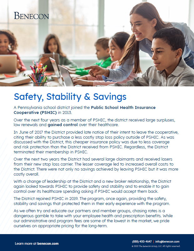
Benecon brand imagery should emphasize people and relationships, professionalism and trust—these are at the core of Benecon’s business.
Photographs of people should be inclusive yet balanced, representing a diversity of genders, races, ages and body types without placing too much emphasis on any one group (unless the content calls for that).
Imagery should feel authentic and real—avoid images that feel overly-posed, dramatic, or unnatural. Strive for simplicity—stay away from imagery containing a lot of fine detail or visual clutter.
Full-color photography is always preferred to monotone images. Monotone imagery may be used if the method of production calls for it (e.g. a black & white advertisement). If imagery runs under text, consider adjusting image brightness or contrast, or adding a neutral, semi-transparent overlay to the image to increase legibility if needed. Color tone should be neutral to slightly warm, and color levels should be medium to light so imagery feels approachable and inviting. Avoid imagery that is overly-saturated—color should feel natural.
Since the brand color palette includes a variety of blues, greens, and blue-toned grays, images that are cool-toned or too dark could make designs feel sterile and uninviting. Neutral-warm tones and lighter imagery will balance well with the overall brand color palette.


Illustrations
Graphic illustrations may be utilized to explain or demonstrate complex concepts—like a multi-step process, an organization/work flow, etc.—or used in place of photography to balance out a design.
Graphics may be simple or detailed depending on the content or concept being illustrated, but should never feel overly complex or overwhelming. Our illustration style is flat and simple, not photo-realistic. Illustrations may include icons (please see page 17 for iconography usage guidelines) or original, custom graphics created in the overall brand style:
- Clean/minimalist design with plenty of white space
- Geometric lines/shapes
- Light-to-medium line weights, slightly rounded corners
- A judicious use of the full Benecon brand color palette
Always ensure designs are well-balanced with both photography and illustration. If a composition feels image heavy, consider adding illustrations and/or icons in place of photography (and vice versa) to create differentiation between content and concepts, add visual interest, and to help users navigate through the design.


